Building Design System for McDonald’s

Building a proper design system that includes notes, rules, behaviour, pure properties, scaling, accessibility, dark mode, and structure.

Year

2021–2024

Team

Design Director, 2 more product designers

My Role

Visual Design, Design System, Leadership and Collaborations

McD Design System collage

Background and Goal

The project had been started because Mcd changed global branding to Feel-Good design, that includes new visual identity principles, new color palette, typography, illustrations etc.

The goal was to ensure consistency, efficiency, and quality across building projects.

Process

I was involved in building a design system for McDonald's, which included notes, rules, behavior, pure properties, scaling, accessibility, dark mode, and structure. The project began when McDonald's changed its global branding to Feel-Good design, which included new visual identity principles, a new color palette, typography, and illustrations. I joined the project in July 2021, when the redesign was in its initial stages.

The main redesigned screens had been created, and there was a UI kit that contained most of the components, but not all of them. There were still some repeated components that had not been added to the UI kit, and it was unstructured, with not all components having all required states, descriptions, and auto-layout. It was a well-structured mess. I started with an audit of the UI kit and restructured it, with one component per page. The developers were involved and they helped with reviewing properties and correcting component naming.

One of the requirements of the Feel-Good design was accessibility based on WCAG2.1, with a focus on color contrast, color design tokens, design system dark mode compatibility, and touch target sizes.

One of the requirements of the Feel-Good design was accessibility based on WCAG2.1, with a focus on color contrast, color design tokens, design system dark mode compatibility, and touch target sizes.

As part of building the design system, I have accomplished the following:

  • Defined and set tokens.

  • Standardized components across platforms, including defining properties, naming, and describing behavior and edge cases.

  • Cleaned and standardized icons.

  • Collected and organized illustrations by usage.

  • Collected and categorized all images.

  • Defined and standardized App Store/Google Play assets, ensuring localization was considered.

Challenges

One of the challenges was that some components needed to be rebuilt from scratch while maintaining their connection to the screens. This was important to avoid the problems that occurred in the past.

Another challenge was to describe the components' states in a clear way for the developers. We also had to provide all the necessary details about the components' behavior, limitations, scaling, and other related information. The design system had to be comprehensive, covering all the possible scenarios that could arise during the development process.

Communication with the development team was also a significant challenge. We had to ensure that the developers had all the information they needed and that they understood the design system's principles and requirements. It was important to have a clear and efficient communication process to ensure that everyone was on the same page and that the project was progressing smoothly.

Accessibility

Dark mode or sematic colors

The initial step in this project was conducting a color contrast audit to ensure compliance with WCAG standards. Some colors were deprecated due to lack of use, while others were updated to meet contrast requirements. This groundwork paved the way for developing a dark mode color palette, built from scratch using the FeelGood design color scheme. Creating this palette involved defining semantic color groups, their names, meanings, and values in collaboration with a developer. Manual adjustments were sometimes needed when plugins failed, but ultimately, dark mode was successfully created and implemented.

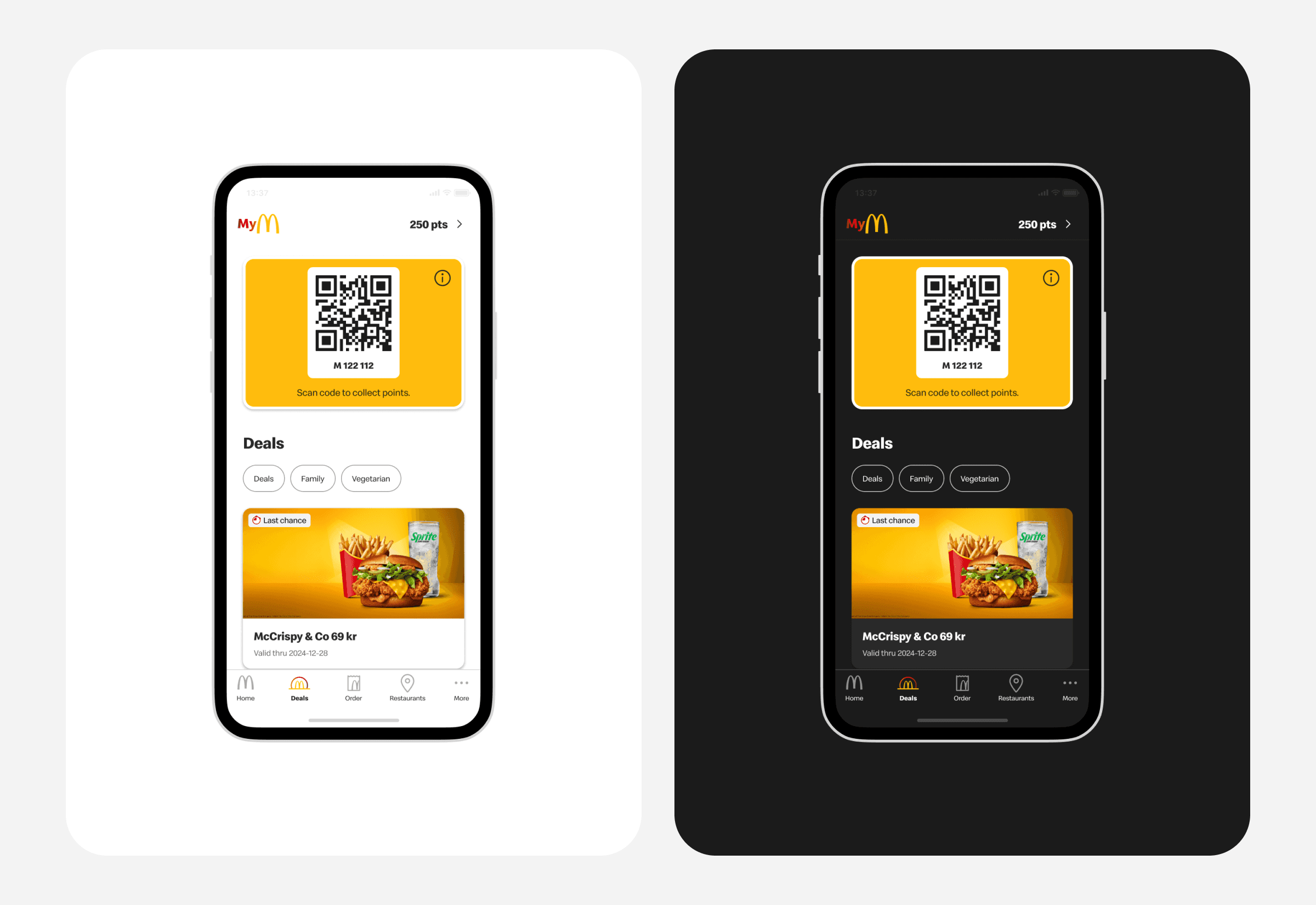
Deals screen in Light and dark Mode

Dynamic type

The biggest part was to describe the components, put correct labels, set right focus and make it all work. From design side, team tried to put a11y notes on component level: role, label, order, highlight ignored elements; and on screen level: elements order and labels. Some components (native ones) got accessibility settings for free, there was no need in defining, cause platforms cover this by itself (like buttons, textfields, cards), but some needed to be described properly. https://www.magentaa11y.com/ service helps a lot and a lot of description was taken from there.

A11y notes on component level

Challenges

Accessibility was a new territory for the team, there was no expert in this topic, so it required time to familiarize and disseminate knowledge across the team.

Copyright © 2025

chris-antonovna

Stockholm, Sweden

Copyright © 2025

chris-antonovna

Stockholm, Sweden

Copyright © 2025

chris-antonovna

Stockholm, Sweden